Tuesday 8 December 2015

Researching main images

·        Camera shots- Most of the main images pictured above are close up shots of the artists face, however there is an exception to this in which a mid shot has been used showing the entirety of the artists upper body, most likely to show off all of his tattoo's (this would explain why he is topless).
·         Angles- They angle is always the same it tends to be head on with no tilt or adjustments to it.
·         Lighting (low key/high key)- All of the main images are quite bright so the artist can be seen very clearly meaning there is no mistaking who the artist is, however in the bottom right one Andy Biersack is the only thing that is light with his entire background being composed of black making him the sole focus.
·         Mode of address- All of the artists appear to be directly addressing the audience of the magazine as they all directly face the camera, this is to make the reader feel as though they have a bond with the artist and makes it personal.
·         Pose/posture- In each of the main images the at least on of those within it is doing something or posing in a certain way eg: the band member of Green Day are all posing in the same way with all of their heads being tilted to one side. A common feature in the main images is an artist having their mouth open giving the impression that they're screaming or shouting, this appears in three of the main images above making it fairly common among these and i also know that it is a common feature throughout Kerrang's main images.
·         Costume- All of those in the main images are wearing punk style clothing which is a convention of those in the main image of punk magazines, however in the top main image only one artist wears punk clothing whilst the other two wear plain coloured t-shirts with one also wearing a hat; in another of the main images an artist has no upper body clothing on however this isn't that uncommon for artists of this genre. 
·         Representation eg: cigarettes, tattoos etc- All of the artists pictured in the main images are men and this is the case for the majority of Kerrang's main images, two of the artists above also have visible tattoos with one having one or two visible on his neck and the over having his entire upper body completely covered in tattoos excluding however some parts of his face. unique hair styles are also another prominent feature of the main images with hair dye playing a part in several, having long hair, hair that stands up etc.
·         Artists or bands?- In all of the main images an artist is featured it is usually one although it is sometimes more than one. Several different bands are represented by one or more of their members including Green Day, Black Veil Brides, My Chemical Romance, Fall Out Boy etc all of which are either punk or metal groups which the magazine focuses on. These bands can tend to be represented by its lead member or one of its lead members in the case of Black Veil Brides they're represented by Andy Biersack who is the lead singer, the last original member and the founder; in Fall Out Boy's case they're represented by Pete Wentz one of their lead lyricists and founders. The main images also don't have to contain people from the same bands the top one is a good example of this as it features three different people from three different groups that are all related by the genre.
·         Colours (monochrome?)- Dark colours and dark shades of colour are used very commonly among the main images with black being a very popular colour featuring in each one of them.

Treatment


This treatment sheet for my magazine gives an insight into various different aspects of my magazine from my target audience to what representations my magazine will contain, It is a quick summary of what I plan my magazine to be.

Hand drawn designs (contents page)


Hand drawn designs (front cover)


Audience research (created using surveymonkey)

I've created two surveys to help with my magazine, one of which is about my mastheads and he other is about the several possible layouts of my magazine. I will use audience feedback to influence my final design.

This is a survey i created to gather feedback on my various masthead names, fonts and styles
https://www.surveymonkey.co.uk/r/JS58CVK

This is a survey I created to gather audience feedback on my various layouts https://www.surveymonkey.co.uk/r/C3S5RZJ

Monday 7 December 2015

Double page spread layouts


Contents page layouts


Front cover layouts


Above are several different ideas for layouts that I've created with three for my front cover, three for my contents page and three for my double page spread. I've broken them up into three separate blog posts as I didn't want one single post containing nine different layouts, Ill pick one from each of the blog posts to use for my magazine.

Thursday 3 December 2015

Mastheads for my Punk magazine

These are several different masthead ideas for my Punk magazine containing different fonts and names, at the moment I cant decide between Punk Craze and Madness for my magazines masthead so I'm going to create a survey so I can receive audience input which will help me to decide.

October 2015 feedback

I will improve upon my existing work by going back through my previous blog posts and adding to each one to get them to proficient /excellent.

Colour scheme

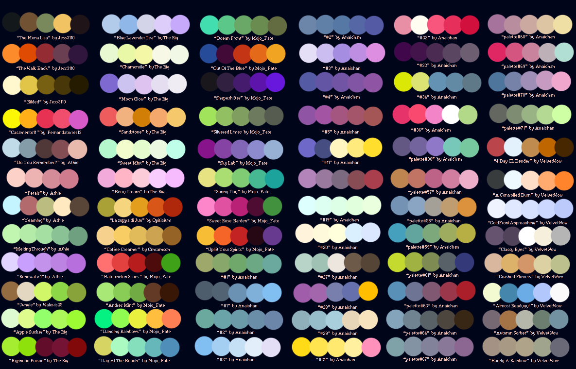
The colours that I plan on using for my magazine could be any of the darker shades on the colour wheel, the chart or the several tabs as dark shading and colouring are common place in Punk and Pop punk magazines so if I conform to these expectations my magazine will hopefully be recognised as being from this genre and stand out from other magazines. I think I'm going to heavily use both red and black, particularly dark shades of said colours as I believe that they'll fit in well with my planned theme, as well as both being visually appealing. I might also include another colour such a white, however I don't want the page to look too busy as that will draw away from the main image, so I'm not sure yet. 

Brand identity/House style of 'KERRANG!' magazine


I've chosen the magazine 'Kerrang!' as it is a Rock magazine that also heavily features Punk, Pop Punk and Metal music. The house style is mostly the same throughout all of the Kerrang! magazine issues an example of this would be the masthead, with the masthead being in capitals, having cracks ruining across its entire length and being at least partially covered by an artist/artists due to the magazine having been around for a fairly long time and being very popular so people will recognise the magazine even if the masthead is partially covered this consistency in the masthead makes the magazine seem professional and makes it easily recognisable, the only difference when it comes to the masthead being the chosen colour of each particular issue with the mastheads colour appearing to be chosen so it contrasts well with the background colour eg: red and white, black and white etc but it always stands out by being bold and colourful. The main image of each issue is always artist/artists to show that the issue contains information on this particular person or group of people. Coverlines are always to the side or bottom of the magazine cover so they can be easily seen giving more information into what the magazine contains yet being out of the way of the masthead or the face of whoever is the main image so it doesn't obstruct the view of passers by Kerrang! appears to have a fairly consistent house style throughout with heavy variation to how the cover is organised here and there.

Magazine analysis of 'Kerrang!'