Tuesday 8 December 2015

Researching main images

·        Camera shots- Most of the main images pictured above are close up shots of the artists face, however there is an exception to this in which a mid shot has been used showing the entirety of the artists upper body, most likely to show off all of his tattoo's (this would explain why he is topless).
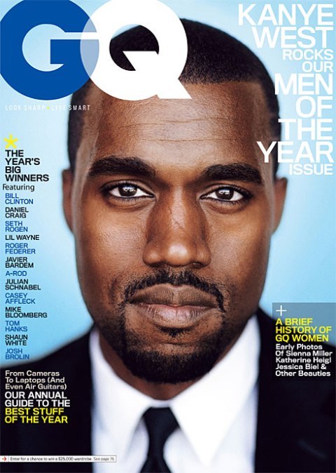
·         Angles- They angle is always the same it tends to be head on with no tilt or adjustments to it.
·         Lighting (low key/high key)- All of the main images are quite bright so the artist can be seen very clearly meaning there is no mistaking who the artist is, however in the bottom right one Andy Biersack is the only thing that is light with his entire background being composed of black making him the sole focus.
·         Mode of address- All of the artists appear to be directly addressing the audience of the magazine as they all directly face the camera, this is to make the reader feel as though they have a bond with the artist and makes it personal.
·         Pose/posture- In each of the main images the at least on of those within it is doing something or posing in a certain way eg: the band member of Green Day are all posing in the same way with all of their heads being tilted to one side. A common feature in the main images is an artist having their mouth open giving the impression that they're screaming or shouting, this appears in three of the main images above making it fairly common among these and i also know that it is a common feature throughout Kerrang's main images.
·         Costume- All of those in the main images are wearing punk style clothing which is a convention of those in the main image of punk magazines, however in the top main image only one artist wears punk clothing whilst the other two wear plain coloured t-shirts with one also wearing a hat; in another of the main images an artist has no upper body clothing on however this isn't that uncommon for artists of this genre. 
·         Representation eg: cigarettes, tattoos etc- All of the artists pictured in the main images are men and this is the case for the majority of Kerrang's main images, two of the artists above also have visible tattoos with one having one or two visible on his neck and the over having his entire upper body completely covered in tattoos excluding however some parts of his face. unique hair styles are also another prominent feature of the main images with hair dye playing a part in several, having long hair, hair that stands up etc.
·         Artists or bands?- In all of the main images an artist is featured it is usually one although it is sometimes more than one. Several different bands are represented by one or more of their members including Green Day, Black Veil Brides, My Chemical Romance, Fall Out Boy etc all of which are either punk or metal groups which the magazine focuses on. These bands can tend to be represented by its lead member or one of its lead members in the case of Black Veil Brides they're represented by Andy Biersack who is the lead singer, the last original member and the founder; in Fall Out Boy's case they're represented by Pete Wentz one of their lead lyricists and founders. The main images also don't have to contain people from the same bands the top one is a good example of this as it features three different people from three different groups that are all related by the genre.
·         Colours (monochrome?)- Dark colours and dark shades of colour are used very commonly among the main images with black being a very popular colour featuring in each one of them.

Treatment


This treatment sheet for my magazine gives an insight into various different aspects of my magazine from my target audience to what representations my magazine will contain, It is a quick summary of what I plan my magazine to be.

Hand drawn designs (contents page)


Hand drawn designs (front cover)


Audience research (created using surveymonkey)

I've created two surveys to help with my magazine, one of which is about my mastheads and he other is about the several possible layouts of my magazine. I will use audience feedback to influence my final design.

This is a survey i created to gather feedback on my various masthead names, fonts and styles
https://www.surveymonkey.co.uk/r/JS58CVK

This is a survey I created to gather audience feedback on my various layouts https://www.surveymonkey.co.uk/r/C3S5RZJ

Monday 7 December 2015

Double page spread layouts


Contents page layouts


Front cover layouts


Above are several different ideas for layouts that I've created with three for my front cover, three for my contents page and three for my double page spread. I've broken them up into three separate blog posts as I didn't want one single post containing nine different layouts, Ill pick one from each of the blog posts to use for my magazine.

Thursday 3 December 2015

Mastheads for my Punk magazine

These are several different masthead ideas for my Punk magazine containing different fonts and names, at the moment I cant decide between Punk Craze and Madness for my magazines masthead so I'm going to create a survey so I can receive audience input which will help me to decide.

October 2015 feedback

I will improve upon my existing work by going back through my previous blog posts and adding to each one to get them to proficient /excellent.

Colour scheme

The colours that I plan on using for my magazine could be any of the darker shades on the colour wheel, the chart or the several tabs as dark shading and colouring are common place in Punk and Pop punk magazines so if I conform to these expectations my magazine will hopefully be recognised as being from this genre and stand out from other magazines. I think I'm going to heavily use both red and black, particularly dark shades of said colours as I believe that they'll fit in well with my planned theme, as well as both being visually appealing. I might also include another colour such a white, however I don't want the page to look too busy as that will draw away from the main image, so I'm not sure yet. 

Brand identity/House style of 'KERRANG!' magazine


I've chosen the magazine 'Kerrang!' as it is a Rock magazine that also heavily features Punk, Pop Punk and Metal music. The house style is mostly the same throughout all of the Kerrang! magazine issues an example of this would be the masthead, with the masthead being in capitals, having cracks ruining across its entire length and being at least partially covered by an artist/artists due to the magazine having been around for a fairly long time and being very popular so people will recognise the magazine even if the masthead is partially covered this consistency in the masthead makes the magazine seem professional and makes it easily recognisable, the only difference when it comes to the masthead being the chosen colour of each particular issue with the mastheads colour appearing to be chosen so it contrasts well with the background colour eg: red and white, black and white etc but it always stands out by being bold and colourful. The main image of each issue is always artist/artists to show that the issue contains information on this particular person or group of people. Coverlines are always to the side or bottom of the magazine cover so they can be easily seen giving more information into what the magazine contains yet being out of the way of the masthead or the face of whoever is the main image so it doesn't obstruct the view of passers by Kerrang! appears to have a fairly consistent house style throughout with heavy variation to how the cover is organised here and there.

Magazine analysis of 'Kerrang!'

Monday 9 November 2015

Second music magazine analysis

Second magazine cover draft


Production Self Assesment/Teacher assesment


My school magazine cover draft evaluation

My masthead is large and is in bold capital lettering so it easily grabs the attention of my audience, it is called 'PB NEWS' which shows people that the magazine contains information about Plantsbrook and it is located at the top of my magazine cover as that is a convention for magazines.
My magazine cover features the Plantsbrook school logo in the top right corner to show people that this magazine represents Plantsbrook and contains information about it, including a logo or brand signature of one kind or another is also a convention when it comes to magazines.
My main image is that of a Plantsbrook student by the name of Maximus Cooper, I chose him as the main image of the magazine as he is not only a Plantsbrook student but a hard working one so i thought he'd be a good choice to be in the public eye.
I placed a puffin (puff) in the bottom right corner of the cover, the puff said 'FREE MAP OF THE NEW BUILDS INSIDE' this will gain catch the eye of nearly everyone in the school and give them more incentive to buy it, as the newly built blocks have become an important part of everyday school life so people will need to know how to find their way around them.
I've also included the schools motto at the bottom of the cover 'be the best you can be' as it reminds those who see it of the schools expectations and is a good image to put across of the school.
I've included several coverlines on the left hand side of the magazine cover to show people what information the magazine contains eg: 'Top 10 revision tips' and 'Private study on when we come back' i used these to draw the attention of my target audience (notably sixth form students) as they will be the ones who are most likely to want or require help with revision and information on private study sessions. 


Friday 6 November 2015

My First School Magazine Cover Draft


Results of my questionnaire (audience research)


The results of my questionnaire gave me quite an insight into the possible audience of my magazine, I found out about age, gender, preferences in colour scheme etc. My results show me that the majority of those who took part in my questionnaire are female although the gap between the genders wasn't too large this should perhaps tell me to aim my magazine towards a female audience. I also found out that the vast majority of those who completed the questionnaire are 17 years old with 80% of the total results down to this age group, with 18 and 11 years contributing 10% each this tells me that my focus should be heavily focused on 17 year olds when I design it as they create a very large majority in my results. I discovered that out of the two masthead options provided a large majority of people preferred 'PB NEWS' over 'PB TIMES' with 70% and 30% respectively, again giving me a clear indication of which masthead I should use for my magazine cover. When asked if people wanted more images, text or neither a large majority of people said that they'd like more images on the cover, this has encouraged me to include a secondary image on my cover but I'll have to see and if I can find room for it without making the cover look crowded. The final question asked people which magazine they actually preferred, whilst results for C were very low at only 20% A and B weren't too far apart from one another with only a 10% gap between then with 35% and 45% respectively, due to A and B being fairly close in terms of choice and without a large majority I'll have to think carefully when choosing a layout for my school magazine. 

Thursday 5 November 2015

September Feedback

This is my feedback for September based on the grading of my work.

Questionnaire (created on Surveymonkey)

This is a questionnaire that I've created to help me change and adapt the designs for my magazine cover https://www.surveymonkey.com/r/GFLXTCG

Friday 16 October 2015

Third finished draft of a school magazine cover (3)

This is the third of my three designs for a school magazine cover. The Masthead is located in the top left corner and is 'PB TIMES' this shows people that the magazine is clearly about Plantsbrook. The masthead is also in bold capital letters so it stand out and appears formal; it is also coloured in black and red as they're the colours of the Plantsbrook uniform. The main image of the magazine cover is located in the centre left of this page and is a student from the school's sixth form. A secondary image is located in the top right of the cover next to the masthead; it is the Plantsbrook logo as it shows people that the magazine is about Plantsbrook. The Coverlines are located in the centre right of the magazine cover next to the main image 'NEED HELP WITH YOUR PERSONAL STATEMENT? SEE MRS COOK' would appeal to sixth former's that may not get the magazine otherwise.


Thursday 15 October 2015

Second finished draft of a school magazine cover (2)

This is the second of my three designs for a school magazine front cover. The Masthead is 'PB NEWS' and is located at the top of the cover, this is to show clearly that the magazine contains information about Plantsbrook school, the masthead is also in bold capital letters and is coloured in light green and yellow as well as having a black outline, this is to make the masthead bright and attractive to passers by. Several coverlines are located on the left of the cover next to the main image and are in four different colours so they stand out. These coverlines are to attract the attention of those students who may not be interested in the main article, an example of this being 'ALLOWED TO LEAVE DURING FREE'S' this would be likely to attract the attention of the school's sixth former's. The main image of this cover is the tree off of the magazine logo, it is located right in the middle of the cover and is colored in green and brown to clearly show that it is a tree. located in the bottom right of the cover is the puss, the puff for this cover is a free £5 book voucher this is likely to get the attention of those who aren't that interested in the magazine but do want the voucher.


Tuesday 6 October 2015

Analysis of a music magazine front cover


Magazine cover layouts created on PowerPoint

These are cover templates for a school magazine, all of them show where different pieces of the magazine will be places eg: masthead, coverline, main image etc.


First finished draft of a school magazine cover (1)

The Masthead is called 'PB NEWS' it is in a black formal font and in capitals, this is to make it stand out and catch peoples attention, this works especially well with the white background due to the contrast between the colours which makes the masthead stand out even more. The main image of this cover is the Plantsbrook emblem as I believe it is easily recognisable and someone could easily tell that the magazine is for Plantsbrook if there was no masthead. The coverlines for this magazine cover are things that will draw peoples attention such as 'NEW P.E KIT!' which will draw the attention of students interested in sport. The magazine also has a puff and it is 'Free ruler this week' which may persuade people to get the magazine simply for the free ruler.


Homework: school magazine drafts

Draft One: Contains the letters P and B to represent Plantsbrook this is also a large portion of the template so it stands out, it has the word news in it to show readers that it contains information and it also contains the Plantsbrook emblem being both the tree and the bridge.

Draft Two: Contains a much larger version of the Plantsbrook emblem, which takes up the majority of its section so it attracts attention and it also contains the letters P and B above the emblem to show that the magazine is about Plantsbrook.

Draft Three: Contains the letters P and B to show that the magazine is about Plantsbrook and it also contains the word 'Times' as it is commonly used with newspapers, this way people may relate it to such newspapers.


Monday 5 October 2015

Lesson two photograph slideshow created on Flickr

So far in photography, I have learned different things such as what a visual lead in is and how it is used to draw a persons attention towards a certain part of an image, this is done by following a line of some sort towards towards the image. I've also learned the effect that different angles, techniques and camera shots can have on a picture and how much of an impact they can have eg: rule of three, visual lead in, depth of field, close up, medium close up, cut-in, cut away etc.


Created with flickr slideshow.


Friday 2 October 2015

Lesson one photograph slideshow created on Flickr


Created with flickr slideshow.

School magazine masthead analysis


The first school magazines masthead is in bold capital letters to start with which are coloured in pink 'independent school' and the second part 'parent' is in lower case lettering and coloured in black the use of pink text is to make the masthead stand out and allow the magazine to be easily seen when on a shelf, the masthead is also likely pink to attract the attention of females and due to the word parent  being included its likely that the target audience for this particular magazine are the mothers of the children who attend the school. the second school magazine.


The second school magazine is in a formal font which suggests that it is aimed at either students in the older year group or the parents of said students, the headline supports this as it says 'for parents of pupils at independent school' which further supports the idea that the target audience is the parents of the pupils at the school. the masthead is also coloured in white whilst being located on a dark background this is to make it stand out and catch peoples eye.


The third school magazine is in bold capital letters and coloured orange and yellow which makes the magazine stand out and catch peoples attention. the school masthead is 'SCHOOL SPORT' which gives a good idea as to who the target audience is, with it likely being student who are interested in sport or extra curricular activities.


Thursday 17 September 2015

Music magazine post


Image result for music magazinesImage result for music magazines
Image result for music magazinesImage result for music magazinesImage result for music magazines


  • All of the magazines use bright colours on the front cover to make them look appealing and attractive, this is to draw the attention of passers and to try and get them to buy it.
  • All of the magazines also feature a famous musical artist on the front cover, to attract those who like that artist to the magazine.
  • All of the magazines also have the artists name on the front cover.
  • All of the magazines also have used several different colours and different shades of colour.